Refer to our Texas Go Math Grade 7 Answer Key Pdf to score good marks in the exams. Test yourself by practicing the problems from Texas Go Math Grade 7 Lesson 11.3 Answer Key Comparing Data Displayed in Box Plots.
Texas Go Math Grade 7 Lesson 11.3 Answer Key Comparing Data Displayed in Box Plots
Essential Question
How do you compare two sets of data displayed in box plots?
Texas Go Math Grade 7 Lesson 11.3 Explore Activity Answer Key
Analyzing Box Plots
Box plots show five key values to represent a set of data, the least and greatest values, the lower and upper quartile, and the median. To create a box plot, arrange the data in order, and divide them into four equal-size parts or quarters. Then draw the box and the whiskers as shown.
The number of points a high school basketball player scored during the games he played this season are organized in the box plot shown.

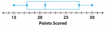
A. Find the least and greatest values.
Least value: _______________ Greatest value: _________
B. Find the median and describe what it means for the data.
C. Find and describe the lower and upper quartiles.
D. The interquartile range is the difference between the upper and lower quartiles, which is represented by the length of the box. Find the interquartile range.
Q3 – Q1 = ___ – ___ = ____
Math Talk
Mathematical processess
How do the lengths of the whiskers compare? Explain what this means.
Reflect
Question 1.
Why is one-half of the box wider than the other half of the box?
Answer:
In box plot of data representation the box represent the 50% or one-half of the data and centre point is the
median of given data. And each smaller box with median point as divider represents the 25% or one-fourth of the
total data. So if one-half of the box is wider than other half, this means that the spread of data or range of that half box is larger as compared to the other half box.
Range of wider box = 27.5 – 21 = 6.5
Range of smaller box = 21 – 17.5 = 3.5
Spread of data of wider box will be more than smaller box.
Example 1.
The box plots show the distribution of times spent shopping by two different groups.
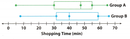
A. Compare the shapes of the box plots.
The positions and lengths of the boxes and whiskers appear to be very similar. In both plots, the right whisker is shorter than the left whisker.
B. Compare the centers of the box plots.
Group A’s median, 47.5, is greater than Group B’s, 40. This means that the median shopping time for Group A is 7.5 minutes more.
C. Compare the spreads of the box plots.
The box shows the interquartile range. The boxes are similar in length.
Group A: 55 – 30 = 25 min Group B: 59 – 32 = 27 min
The length of a box plus its whiskers shows the range of a data set. The two data sets have similar ranges.
Math Talk
Mathematical Processes
Which store has the shopper who shops longest? Explain how you know.
Reflect
Question 2.
Which group has the greater variability in the bottom 50% of shopping times? The top 50% of shopping times? Explain how you know.
Answer:
In box plot of data representation the box represent the 50% or one-half of the data and centre point is the
median of given data So left side of median or centre point represent bottom 50% of data and the right side
represents the top 50% of the data. Now calculating the top and bottom 50% of data.
For Group A:
Range of top 50% of data = Maximum value – Median
= 65 – 48
= 17
Range of bottom 50% of data = Median – Minimum value
= 48 – 5
= 43
For Group B:
Range of top 50% of data = Maximum value – Median
= 66 – 40
= 26
Range of bottom 50% of data = Median – Minimum value
= 40 – 8
= 32
Hence, Group A has greater variability is h. bottom 50% of the shopping times and Group B has greater variability in top 50% of shopping times.
Group A in botton 50%
Group B in top 50%
Your Turn
Question 3.
The box plots show the distribution of weights in pounds of two different groups of football players. Compare the shapes, centers, and spreads of the box plots.
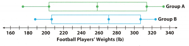
Answer:
Comparing the shape, centre, and spread of the data in box plot:
Shape of box plots: Both right and left whisker of Group A is Longer as compared to whisker of Group B.
Center of box plots: Median or centre of group A is 249 and of Group B is 265. So median of the group B is more
than the median of group A.
Spread of box plots: Spread or range of the group A is more as compared to spread of group B. Also the size of
box of group A is longer than the group B which means that the interquartile range of group A will be greater than group B.
Median of group A is 249 and of group B is 250.
Example 2.
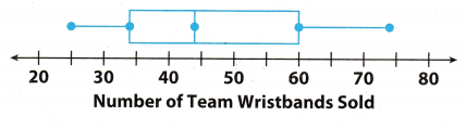
The box plots show the distribution of the number of team wristbands sold daily by two different stores over the same time period.
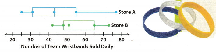
A. Compare the shapes of the box plots.
Store A’s box and right whisker are longer than Store B’s.
B. Compare the centers of the box plots.
Store A’s median is about 43, and Store B’s is about 51. Store A’s median is close to Store B’s minimum value, so about 50% of Store A’s daily sales were less than sales on Store B’s worst day.
C. Compare the spreads of the box plots.
Store A has a greater spread. Its range and interquartile range are both greater. Four of Store B’s key values are greater than Store A’s corresponding value. Store B had a greater number of sales overall.
Your Turn
Question 4.
Compare the shape, center, and spread of the data in the box plot with the data for Stores A and B in the two box plots in Example 2.
Answer:
Comparing the shape, centre, and spread of the data in box plot:
Shape of box plots: Right whisker of given box pLot is longer than the right whisker of store B but smaller than the right wisher of store A
Center of box plots: Median or centre of given box plot is tata, median of store A is 43 and the median of store B is 51. Median of store B is highest.
Spread of box plots: Spread or range of the given box plot is greater than the store B box plot but smaller than
the spread of the store A.
Median of given box plot is 44 and of store A is 43 and of store B is 51.
Texas Go Math Grade 7 Lesson 11.3 Guided Practice Answer Key
For 1-3, use the box plot Terrence created for his math test scores. Find each value. (Explore Activity)
Question 1.
Minimum = ________ Maximum = ____
Answer:
On observating the given box plot Terrence of math test scores the scores are: 72, 75, 79, 85, & 88.
Minimum = 72
Maximum = 88
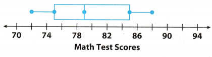
Question 2.
Median = ___
Answer:
On observating the given box plot Terrence of math test scores the scores are:
72, 75, 79, 85, & 88.
Here total number of term is 5 which is an odd number. We know that when total number of terms is an odd then the median of the given data is middle term. So the median of the math test scores will be the 3rd term.
Median = 3rd term = 79
Question 3.
Range = __________ IQR = __________
Answer:
On observating the given box plot Terrence of math test scores the scores are:
72, 75, 79, 85, & 88.
Here, the range of math test scores by the students will be the difference of maximum and minimum score of the students.
Range = Max value – Min value = 88 – 72 = 16
For 4-7, use the box plots showing the distribution of the heights of hockey and volleyball players. (Example 1 and 2)
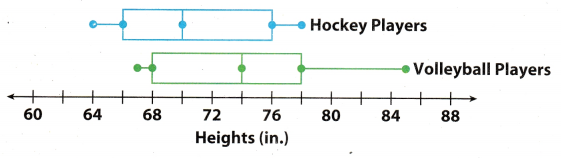
Question 4.
Which group has a greater median height? ________
Answer:
On observating the given box plot the heights of player are:
Hockey players: 64, 66, 70, 76, & 78.
Volleyball players: 67,68, 74, 78, & 85.
Here total number of term is 5 which is an odd number. We know that when total number of terms is an odd then the median of the given data is middle term. So the median of height of players will be the 3rd term.
Median of hockey player = 3rd term = 70
Median of volleyball player = 3rd term = 74
Hence, the median height of volleyball players are greater as compared to the median height of hockey players.
Question 5.
Which group has the shortest player? _____________ ______________
Answer:
On observating the given box plot the heights of player are:
Hockey players: 64, 66, 70, 76, & 78.
Volleyball players: 67, 68, 74, 78, & 85.
Here on comparing the heights of both group hockey and volleyball players we can see that the minimum height of hockey player is 64 inch where as the minimum height of the volleyball player is 67 inch. So the shortest player is of 64 inch and belongs to the hockey group.
Hence, the hockey group has shortest player of 64 inch.
Question 6.
Which group has an interquartile range of about 10? __________________
Answer:
On observating the given box plot the heights of player are:
Hockey players: 64, 66, 70, 76, & 78.
Volleyball players: 67, 68, 74, 78, & 85.
Here the box shows the interquartile range. The interquartile angle is the difference between the upper and lower quartile, which is represented by the length of the box
Interquartile range of hockey group = Q3 – Q1 = 78 – 68 = 10
Interquartite range of volleyball group = Q3 – Q1 = 76 – 66 = 10
Hence, both the group has interquartile range of 10
Both the group has interquartile range of 10
Essential Question Check-In
Question 7.
What information can you use to compare two box plots?
Answer:
By seeing and comparing box plot of both the data we can conclude :
- The range of heights of volleyball group is greater then as compared to the hockey group.
- The volleyball group has greater spread then hockey group.
- Median of hockey group is greater.
- Interquartile range of both group are same.
Volleyball group has greater spread
Texas Go Math Grade 7 Lesson 11.3 Independent Practice Answer Key
For 8-11, use the box plots of the distances traveled by two toy cars that were jumped from a ramp.
Question 8.
Compare the minimum, maximum, and median of the box plots.
Answer:
The distance travelled by both car are:
Car A: 165, 170, 180, 195, 210
Car B: 160, 175, 185, 200, 205
Minimum and Maximum of Car A = 165 & 210
Minimum and Maximum of Car B = 160 & 205
The total number of terms in both case 5 which is odd and we know that in case of odd number the median is the middle term. So 3rd term will be the median in both case.
Median of car A = 180
Median of car B = 185
Question 9.
Compare the ranges and interquartile ranges of the data in box plots.
Answer:
The distance travelled by both car are:
Car A: 165, 170, 180, 195, 210
Car B: 160, 175, 185, 200, 205
We know that Range = Max value – Min value
Range of Car A = 210 – 165 = 45
Range of Car A = 205 – 160 = 45
Interquartile of car A = 195 – 170 = 25
Interquartite of car B = 200 – 175 = 25
Question 10.
What do the box plots tell you about the jump distances of two cars?
Answer:
On comparing the box Plots data of two cars are :
- The range of both the car A and B are same which is 13.
- The interquartile of both the car A and B are same which is 25.
- The median of the car B is greater as compared to the car A.
range and interquartile of both cars are same.
Question 11.
Critical Thinking What do the whiskers tell you about the two data sets?
Answer:
The length of the whisker shows the range of the a data set.
The left whiskers of the car A is smaLler then the left whiskers of the car B and the right whiskers of car A is longer then the right whiskers of car B but over all length of the whiskers of both the car A and Car B is same. This means that the range of two data sets are same.
Range of two data sets are same.
For 12-14, use the box plots to compare the costs of leasing cars in two different cities.
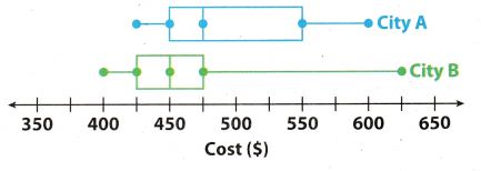
Question 12.
In which city could you spend the least amount of money to lease a car? The greatest?
Answer:
The cost of leasing cars in two different cities are:
City A: 425, 450, 475, 550, 600
City B : 400, 425, 450, 475, 625
Mean of the cost in city A = \(\frac{425+450+475+550+600}{5}\)
= \(\frac{2500}{5}\)
= 500
Mean of the cost in city B = \(\frac{400+425+450+475+625}{5}\)
= \(\frac{2375}{5}\)
= 475
Hence, In city B it will take least amount for leasing the car and it city A it will take greatest amount to lease a car.
Least in city B and greatest in city B.
Question 13.
Which city has a higher median price? How much higher is it?
Answer:
The cost of leasing cars in two different cities are:
City A: 425, 450, 475, 550, 600
City B : 400, 425, 450, 475, 625
Here total number of terms is 5 which is an odd number. And we know that number of terms is odd then the median is middle term. So in this case the median will be the 5th term of given data.
Median price of city A = 3rd term = 475
Median price of city b = 3rd term = 450
Hence, the median price of city A is higher as compared to the median price of the city B.
Median price of city A is higher.
Question 14.
Make a Conjecture In which city is it more likely to choose a car at random that leases for less than $450? Why?
Answer:
In city B it is more likely to choose a car at random that leases for less than $450.
Because in city A only two data shows that we can lease the car for $450 or less but in case of city B the three data shows that we can lease a car for $450 or less. So the chances of leasing a car for less than $450 is more in case of city B.
Question 15.
Summarize Look back at the box plots for 12-14 on the previous page. What do the box plots tell you about the costs of leasing cars in those two cities?
Answer:
On comparing the box plot of the city A and city B we can see that box of city A is longer than the box of city B. So the interquartile range of the city A is more as compared to the interquartile range of city B. This means that the cost of leasing a car in city B does not vary much at different place inside city and is around its median price which is $450 whereas in case of city A tile price for leasing a car varies much as compared to the median price of city A.
Median price of city A is higher than median price of city B
Texas Go Math Grade 7 Lesson 11.3 H.O.T. Focus On Higher Order Thinking Answer Key
Question 16.
Draw Conclusions Two box plots have the same median and equally long whiskers. If one box plot has a longer box than the other box plot, what does this tell you about the difference between the data sets?
Answer:
In box plot of data representation the box represents the 50% of data and the left and right whisker both represents the other 50% of data.
If two box plots have the same median and equally long whiskers but one box is longer than the other box, then this means that the interquartile range (higher quartile – tower quartile) of the longer box data set must be greater than the interquartile range of smaller box.
Longer box will have greater interquartile range.
Question 17.
Communicate Mathematical Ideas What can you learn about a data set from a box plot? How is this information different from a dot plot?
Answer:
Using a box plot, you can determine the least and greatest values, the lower and upper quartiles and the median
Furthermore, you could also determine the interquartile range (the difference between the upper and lower
quartile). The difference between the box plot and dot plot is that the box plot shows the summary of the data set
while the dot plot shows all the values. For dot plot, in order to determine the median, you still need to calculate it.
Also, dot plots only work in a small set of values while box plots work in large data sets.
The median, least and greatest values and the lower and upper quartiles of a given data set
Question 18.
Analyze Relationships In mathematics, central tendency is the tendency of data values to cluster around some central value. What does a measure of variability tell you about the central tendency of a set of data? Explain.
Answer:
Measure of variability tells us how much diversity there is in a distribution of data, or how much is data scattered
from the central value.
Measure of variability is how much diversity there is in a distribution of data.