Refer to our Texas Go Math Grade 8 Answer Key Pdf to score good marks in the exams. Test yourself by practicing the problems from Texas Go Math Grade 8 Lesson 14.1 Answer Key Scatter Plots and Association.
Texas Go Math Grade 8 Lesson 14.1 Answer Key Scatter Plots and Association
Texas Go Math Grade 8 Lesson 14.1 Explore Activity Answer Key
Explore Activity 1
Making a Scatter Plot
Recall that a set of bivariate data involves two variables. Bivariate data are used to explore the relationship between two variables. You can graph bivariate data on a scatterplot. A scatter plot is a graph with points plotted to show the relationship between two sets of data.
The final question on a math test reads, “How many hours did you spend studying for this test?”The teacher records the number of hours each student studied and the grade the student received on the test.
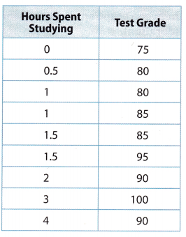
A. Make a prediction about the relationship between the number of hours spent studying and test grades.
B. Make a scatter plot. Graph hours spent studying as the independent variable and test grades as the dependent variable.
Reflect
Question 1.
What trend do you see in the data?
Answer:
You can make a scatter plot which will help you to decide what trend do you see in the data.
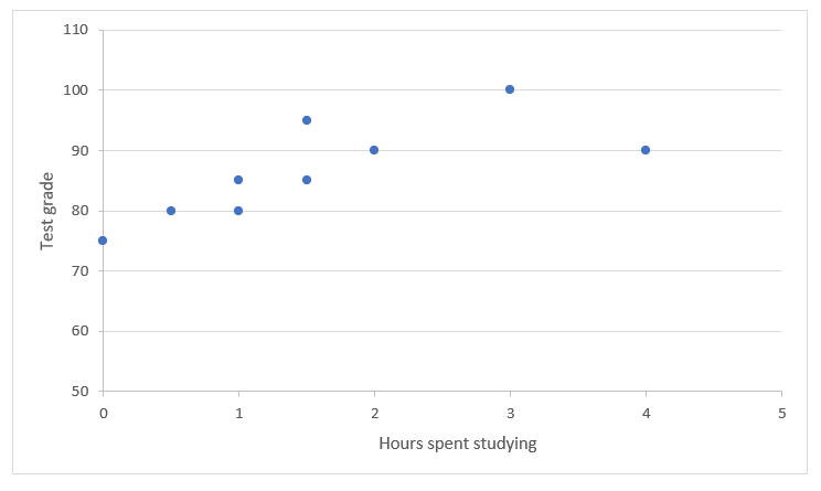
Trend shows positive association which means that both data sets increase together.
Question 2.
Justify Reasoning Do you think that studying for 10 hours would greatly increase a student’s grade?
Answer:
The grade associated with studying for 10 hours would follow this trend. Students who spent more hours studying will have better test results.
Explore Activity 2
Interpreting Clusters and Outliers
A cluster is a set of closely grouped data. Data may cluster around a point or along a line. An outlier is a data point that is very different from the rest of the data in the set.
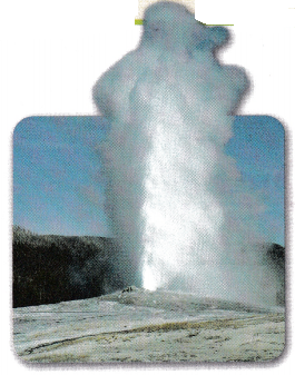
A scientist gathers information about the eruptions of Old Faithful, a geyser in Yellowstone National Park. She uses the data to create a scatter plot. The data show the length of time between eruptions (interval) and how long the eruption lasts (duration).
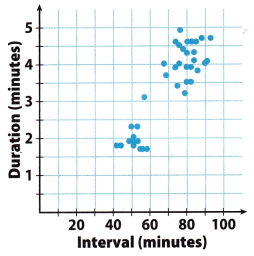
A. Describe any clusters you see in the scatter plot.
B. What do the clusters tell you about eruptions of Old Faithful?
C. Describe any outliers you see in the scatter plot.
Reflect
Question 3.
Suppose the geyser erupts for 2.2 minutes after a 75-minute interval. Would this point lie in one of the clusters? Would it be an outlier? Explain your answer.
Answer:
Try to make a point that is given in a scatter plot and make conclusions based on that.
If the geyser erupts for 22 minutes after a 75-minute interval, this point would not lie in one of the clusters. It will be an outlier.
This point will be an outlier because it will not be a part of a set of closely grouped data. This set is pointed between intervals of 40 and 60 minutes, and they last between 1.5 and 2.5 minutes. Based on that, the geyser which erupts for 2.2 minutes after a 75-minute interval will present a data point that is very different from the rest of the data in the set.
Question 4.
Suppose the geyser erupts after an 80-minute interval. Give a range of possible duration times for which the point on the scatter plot would not be considered an outlier. Explain your reasoning.
Answer:
Use a given scatter plot to find out a range of possible duration.
If the geyser erupts after an 80-minute interval, the range of possible duration times for which the point on the scatter plot would not be considered an outlier is between 3 and 5 minutes.
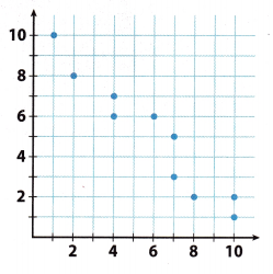
Example 1
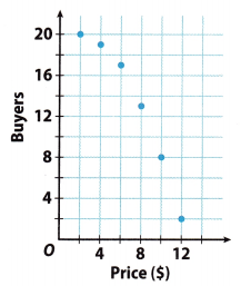
Susan asked 20 people if they would buy a new product she developed at each of several prices. The scatter plot shows how many of the 20 said “yes” at a given price. Describe the association between price and the number of buyers.
Answer:
As price increases, the number of buyers decreases. So, there is a negative association. Because the data points do not lie along a line, the association is nonlinear.
Reflect
Question 5.
What If? Based on the association shown in the scatter plot, what might happen if Susan increased the price to $14?
Answer:
As the price increases, the number of buyers decreases. So, there is a negative association.
If Susan increases the price to 14 $. then the number of buyers will be smaller than it has been. It might happen that there will not be buyers.
Your Turn
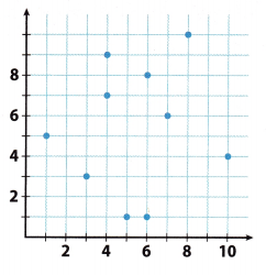
Question 6.
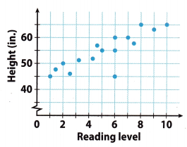
The plot shows the reading level and height for 16 students in a district. Describe the association and give a possible reason for it.
Answer:
The association is positive and linear. Taller students are likely to be oLder students and would therefore be more likely to read at a higher level.
Texas Go Math Grade 8 Lesson 14.1 Guided Practice Answer Key
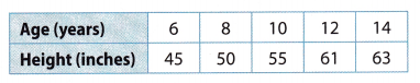
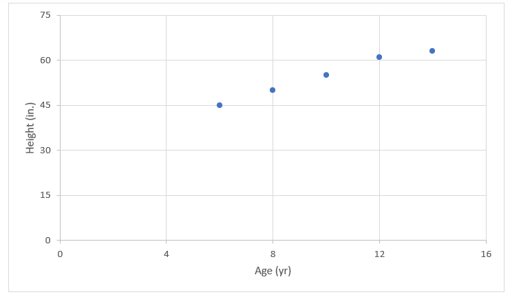
Bob recorded his height at different ages. The table below shows his data.
Question 1.
Make a scatter plot of Bob’s data. (Explore Activity 1)
Answer:
Make a scatter plot.
Question 2.
Describe the association between Bob’s age and his height. Explain the association. (Example 1)
Answer:
The association is positive and linear. Bob’s height increases as he gets older. We would see that Bob’s height eventually stops increasing if the data continued.
Question 3.
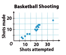
The scatter plot shows the basketball shooting results for 14 players. Describe any clusters you see in the scatter plot. Identify any outliers. (Explore Activity 2)
Answer:
There is a cluster in the ‘20 – 25” shots attempted range and a smaller cluster in the “5 – 14” shots attempted range.
There is an outlier at (35, 18)
Essential Question Check-In
Question 4.
Explain how you can make a scatter plot from a set of bivariate data.
Answer:
A set of bivariate data involves two variables. To explore the relationship between two variables, we use bivariate data. A graph with points plotted to show the relationship between two sets of data is called a scatter plot.
So, there are two variables in every bivariate data, usually an x and y. Data set we’re asked to create a scatter plot of the data described.
All we need is to plot the data from the bivariate data table onto the graph and see if there is a correlation between them.
Texas Go Math Grade 8 Lesson 14.1 Independent Practice Answer Key
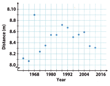
Sports: Use the scatter plot for 5-8.
Question 5.
Describe the association between the year and the distance jumped for the years 1960 to 1988.
Answer:
Generally, the data shows a positive linear association. The winning distance increases as the year increases.
Question 6.
Describe the association between the year and the distance jumped for the years after 1988.
Answer:
Between 1996 and 2004, there was a slight increase in distance jumped over time. However, overall, the data between 1988 to 2012 show a negative association.
Question 7.
For the entire scatter plot, is the association between the year and the distance jumped linear or nonlinear? Explain.
Answer:
The data show a rise between 1960 and 1988. The data also show a fall between 1988 and 2012. Therefore, overall, there is nonlinear pattern.
Question 8.
Identify the outlier and interpret its meaning.
Answer:
The outlier is at (1968, 8.9). It represents a long jump of 8.9 meters in 1968 that exceeds the other jumps made in the surrounding years.
Question 9.
Communicate Mathematical Ideas Compare a scatter plot that shows no association to one that shows a negative association.
Answer:
Randomly scattered data points with no apparent pattern define a scatter plot with no association. Data points that fall from left to right and has data set values that increases as the other decreases define a scatter plot with a negative association
For 10-11, describe a set of real-world bivariate data that the given scatter plot could represent. Define the variable represented on each axis.
Question 10.
Answer:
The x-axis represents the number of containers.
The y-axis represents the price per container.
Question 11.
Answer:
The x-axis represents the number of hours spent watching tv. The y-axis represents the number of tvs owned.
H.O.T. Focus on Higher Order Thinking
Question 12.
Multiple Representations Describe what you might see in a table of bivariate data that would lead you to conclude that the scatter plot of the data would show a cluster.
Answer:
You would see data points with x and y values that are close together.
Question 13.
Justify Reasoning Is it possible for a scatter plot to have a positive or negative association that is not linear? Explain.
Answer:
Yes; it is possible for a scatter plot to have a positive or negative association that is not linear. The data points may have a falling or rising curve that will exhibit a nonlinear association.
Question 14.
Critical Thinking To try to increase profits, a theater owner increases the price of a ticket by $25 every month. Describe what a scatter plot might look like if x represents the number of months and y represents the profits. Explain your reasoning.
Answer:
Initially, the number of tickets sold might decline, but the price increase would offset the loss in sales. That means that profit would increase, showing a positive association.
When the price of a ticket would get too high, ticket sales would decline rapidly, so profits would fall giving a negative association.