Refer to our Texas Go Math Grade 7 Answer Key Pdf to score good marks in the exams. Test yourself by practicing the problems from Texas Go Math Grade 7 Lesson 11.2 Answer Key Comparing Data Displayed in Dot Plots.
Texas Go Math Grade 7 Lesson 11.2 Answer Key Comparing Data Displayed in Dot Plots
Essential Question
How do you compare two sets of data displayed in dot plots?
Texas Go Math Grade 7 Lesson 11.2 Explore Activity Answer Key
Analyzing Dot Plots
You can use dot plots to analyze a data set, especially with respect to its center and spread.
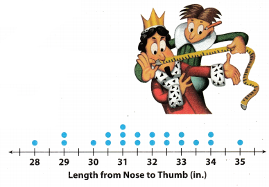
People once used body parts for measurements. For example, an inch was the width of a man’s thumb. In the 12th century, King Henry I of England stated that a yard was the distance from his nose to his outstretched arm’s thumb. The dot plot shows the different lengths, in inches, of the “yards” for students in a 7th grade class.
A. Describe the shape of the dot plot. Are the dots evenly distributed or grouped on one side?
B. What value best describes the center of the data? Explain how you chose this value.
C. Describe the spread of the dot plot. Are there any outliers?
Reflect
Question 1.
Calculate the mean, median, and range of the data in the dot plot.
Answer:
To find the mean, add the numbers and divide the sum by the number of addends.
28 + 29 + 29 + 30 + 30.5 + 30.5 + 31 + 31 + 31 + 31.5 + 31.5 + 32 + 32 + 32.5 + 32.5 + 33 + 33 + 33.5 + 34 + 34 + 35 = 664.5
\(\frac{664.5}{21}\) = 31.64
Mean is 31.64
The median is the middle number of the data in the dot plot that is ordered from least to greatest

Range is the difference between the greatest and least number of the data in the dot plot
range = 35 – 28 = 7
Mean : 31.64
Median : 31.7
Range : 7
Comparing Dot Plots Visually
You can compare dot plots visually using various characteristics, such as center, spread, and shape.
Example 1.
The dot plots show the heights of 15 high school basketball players and the heights of 15 high school softball players.
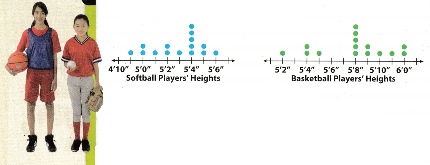
A. Visually compare the shapes of the dot plots.
Softball: All the data is 5’6” or less.
Basketball: Most of the data is 5’8” or greater.
As a group, the softball players are shorter than the basketball players.
B. Visually compare the centers of the dot plots.
Softball: The data is centered around 5’4’
Basketball: The data is centered around 5’8’
This means that the most common height for the softball players is 5 feet 4 inches, and for the basketball players 5 feet 8 inches.
C. Visually compare the spreads of the dot plots.
Softball: The spread is from 4’11 “to 5’6”.
Basketball: The spread is from 5’2” to 6’0’
There is a greater spread in heights for the basketball players.
Math Talk
How do the heights of field hockey players compare with the heights of softball and basketball players?
Your Turn
Question 2.
Visually compare the dot plot of heights of field hockey players to the dot plots for softball and basketball players. 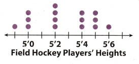
Shape: _______________
Center: _______________
Spread: _______________
Answer:
Shapes:
Hockey: All the data is 5’6” or less.
The hockey players are shorter than the basketball players, but taller than the softball players.
Center:
Hockey: The data is centered around of 5’2”.
Spread:
Hockey: The spreads is from 4’9” to 5’6”.
They have same spread as spread for softball players, but there is a greater spread in heights for the basketball players.
All the data is 5’6″ or Less.
The data is centered around of 5’2”.
The spreads is from 4’9” to 5’6″.
Comparing Dot Plots Numerically
You can also compare the shape, center, and spread of two dot plots numerically by calculating values related to the center and spread. Remember that outliers can affect your calculations.
Example 2
Numerically compare the dot plots of the number of hours a class of students exercises each week to the number of hours they play video games each week.
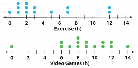
A. Compare the shapes of the dot plots.
Exercise: Most of the data is less than 4 hours.
Video games: Most of the data is 6 hours or greater.
B. Compare the centers of the dot plots by finding the medians.
Median for exercise: 2.5 hours. Even though there are outliers at
12 hours, most of the data is close to the median.
Median for video games: 9 hours. Even though there is an outlier at 0 hours, these values do not seem to affect the median.
C. Compare the spreads of the dot plots by calculating the range.
Exercise range with outlier: 12 – 0 = 12 hours
Exercise range without outlier: 7 – 0 = 7 hours
Video games range with outlier: 14 – 0 = 14 hours
Video games range without outlier: 14 – 6 = 8 hours
Math Talk
Mathematical Processes
How do outliers affect the results of this data?
Your Turn
Question 3.
Calculate the median and range of the data in the dot plot. Then compare the results to the dot plot for Exercise in Example 2.
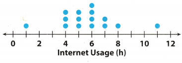
Answer:
Median for Internet Usage: 6 hours
Most of the data is close to the median
Median for Exercise: 2.5 hours
Internet Usage range with outliers: 11 – 1 = 10 hours
Internet usage range without outliers: 8 – 4 = 4 hours
Exercise range with outlier: 12 hours
Exercise range without outlier: 7 hours
Median for Internet Usage : 6 hours
Internet Usage range:
- With outliers: 10 hours
- Without outliers: 4 hours
Texas Go Math Grade 7 Lesson 11.2 Guided Practice Answer Key
The dot plots show the number of miles run per week for two different classes. For 1-5, use the dot plots shown.
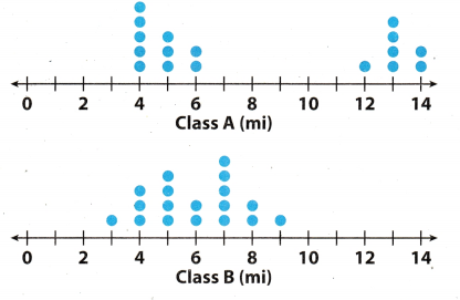
Question 1.
Compare the shapes of the dot plots.
Answer:
Class A: Most of the the data is 6 mi. or less.
Class B: All the data is 3 mi. or greater
As a class, Students from Class A run more than students from Class B
Class A: Most of the the data is 6 mi. or less.
Class B: All the data is 3 mi. or greater
As a class, Students from Class A run more than students from Class B.
Question 2.
Compare the centers of the dot plots.
Answer:
Class A: The data is centred around 4 mi.
Class B: The data is centred around 7 mi.
Question 3.
Compare the spreads of the dot plots.
Answer:
Class A: The spread is from 4 mi. to 14 mi
Class B: The spread is from 3 mi. to 9 mi.
Question 4.
Calculate the medians of the dot plots.
Answer:
Median for Class A: 7.5 mi.
Median for Class B: 5.75 mi.
Question 5.
Calculate the ranges of the dot plots.
Answer:
Class A range with outliers: 14 – 4 = 10 mi
Class A range without outliers: 6 – 4 = 2 mi
Class B range: 9 – 3 = 6 mi
For Class B the outlier doesn’t exist.
Class A range with outliers: 10 mi
Class A range without outliers: 2 mi
Class B range: 6 mi
For Class B the outlier doesn’t exist.
Essential Question Check-In
Question 6.
What do the medians and ranges of two dot plots tell you about the data?
Answer:
The medians of any data represents the centre or almost centre point of the given data. So in above two dot plots
the medians tells that which of the given dots have higher value. And the range of any data set represent the value around which all the data are spread. So in second dot plot the dots are very close as compared to first dot plot which means in second dot plots the value of data are closer.
Median of any data represent centre value.
Texas Go Math Grade 7 Lesson 11.2 Independent Practice Answer Key
The dot plot shows the number of letters in the spellings of the 12 months. Use the dot plot for 7-10.
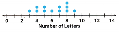
Question 7.
Describe the shape of the dot plot.
Answer:
All of the data are 3 letters or more.
Question 8.
Describe the center of the dot plot.
Answer:
The data are centered around 8 letters.
Question 9.
Describe the spread of the dot plot.
Answer:
The spread is from 3 to 9 letters.
Question 10.
Calculate the mean, median, and range of the data in the dot plot.
Answer:
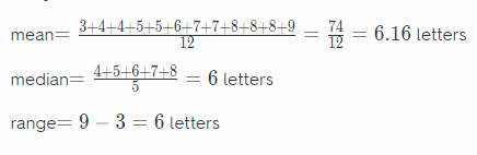
Mean: 6.16 letters
Median: 6 Letters
Range: 6 Letters
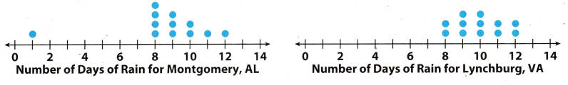
The dot plots show the mean number of days with rain per month for two cities.
Question 11.
Compare the shapes of the dot plots.
Answer:
Number of Days of rain for Montogomery, AL: All of the data is 12 days or less.
Number of Days of rain for Lynchburg, VA: All of the data is 8 days or more.
There are more days of rain in Lynchburg than Montogomery.
Question 12.
Compare the centers of the dot plots.
Answer:
Montgomery: The data is centered around 8 days
Lynchburg: The data is centered around 10 days.
Question 13.
Compare the spreads of the dot plots.
Answer:
Montgomery: The spread is from 1 day to 12 days.
Lynchburg: The spread is from 8 days to 12 days.
Question 14.
What do the dot plots tell you about the two cities with respect to their average monthly rainfall?
Answer:
The dot plot for Montgomery, AL showed that the average monthly rainfall in their city is inconsistent. The dot plot showed that there are days where the rainfall is heavy then it changes. Also, there is an outlier which made it more inconsistent For Lynchburg, VA, the average monthly rainfall in their city is somewhat consistent. Also, the days were relatively closer.
The average monthly rainfall in Lynch burg, VA is more consistent compared to Montgomery, AL.
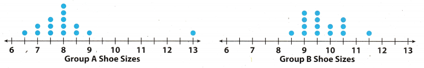
The dot plots show the shoe sizes of two different groups of people.
Question 15.
Compare the shapes of the dot plots.
Answer:
Group A: All of the data is 65 or greater
Group B: All of the data is 8.5 or greater.
Group B has greater sizes of shoe than Group A.
Question 16.
Compare the medians of the dot plots.
Answer:
Median for Group A: 8 size of shoe
Median for Group B:
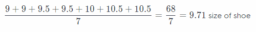
Median for Group A: 8 size of shoe
Median for Group B: 9.71 size of shoe
Question 17.
Compare the ranges of the dot plots (with and without the outliers).
Answer:
Group A range with outliers: 13 – 6.5 = 6.5 size of shoe
Group A range without outliers: 9 – 6.5 = 2.5 size of shoe
Group B range with outliers: 11.5 – 8.5 = 3 size of shoe
Group B range without outliers: 11.5 – 8.5 = 3 size of shoe
Group A range with outliers is 65 size of shoe
Group A range without outliers is 2.5 size of shoe
Group B range with outliers is 3 size of shoe
Group B range without outliers is 3 size of shoe
Question 18.
Make A Conjecture Provide a possible explanation for the results of the dot plots.
Answer:
Group A probably consists mostly of younger people and/or women (who tends to have smaller feet). Group B, on
the other hand, consists mostly of adults (who tends to have bigger feet).
Group A consists of younger people while Group B consists of adults.
Texas Go Math Grade 7 Lesson 11.2 H.O.T. Focus On Higher Order Thinking Answer Key
Question 19.
Analyze Reltionships Can two dot plots have the same median and range but have completely different shapes? Justify your answer using examples.
Answer:
Yes, two dot plots can have the same median and range but completely different shapes.
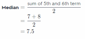
In both the given dot plot the median is 6th term which is 7 and also the range of both dot plot is 7.
Dot plot of type A data is shown below:
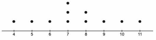
Dot plot of type B data is shown below:
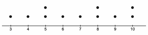
Yes, two dot plot can have same median and range.
Question 20.
Draw Conclusions What value is most affected by an outlier, the median or the range? Explain. Can you see these effects in a dot plot?
Answer:
Range is the most affected by an outlier.
This can be understood by the example given below:
For examle the data of the sample are : 3, 5, 5, 5, 7, 8, 8, 9, 10, 12, 15.
Median = 6th term of data
= 8
Range = 15 – 3
= 12
New samle after excluding outlier: 3, 5, 5, 5, 7, 8, 8, 9, 10, 12.
Range = 12 – 3
= 9
Here we can see that median decreases by only 0.5 but the range decreases by 3. Hence we can see that range is most afffected by outlier.
Range is most affected by outlier